
Image by Benjamin O. Tayo.
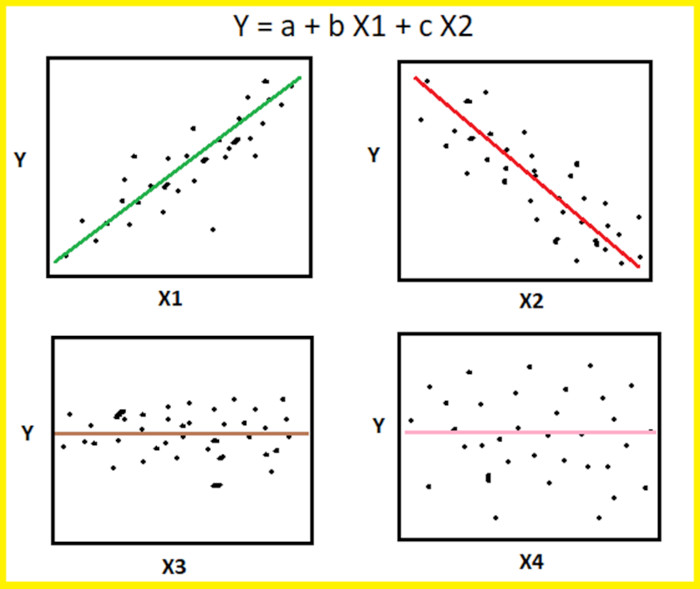
The scatter pairplot is a visualization of pairwise relationships in a dataset and is the first step for effective feature selection. It provides a qualitative analysis of the pairwise correlation between features and is a powerful tool for feature selection and dimensionality reduction. For an introduction of the pairplot using the seaborn package, see this link: https://seaborn.pydata.org/generated/seaborn.pairplot.html
In this article, we will analyze a portfolio of stocks to examine the ones that are strongly correlated to the overall market. The portfolio contains 22 stocks (see Table 1) from different sectors such as Healthcare, Real Estate, Consumer Discretionary, Energy, Industrials, Telecommunication Services, Information Technology, Consumer Staples, and Financials.
| Symbol | Name | Symbol | Name | Symbol | Name |
| AAL | American Airlines | EDIT | Editas Medicine | UAL | United Airlines |
| AAPL | Apple | HPP | Hudson Pacific Properties | WEN | Wendy |
| ABT | Abbott Laboratories | JNJ | Johnson & Johnson | WFC | Wells Fargo |
| BNTX | BioNTech | MRNA | Moderna | WMT | Walmart |
| BXP | Boston Properties | MRO | Marathon Oil Corporation | XOM | Exxon Mobile |
| CCL | Carnival Corporation | PFE | Pfizer | SP500 | Stock Market Index |
| DAL | Delta Airlines | SLG | SL Green Realty | ||
| DVN | Devon Energy | TSLA | Tesla |
Table 1. Portfolio of 22 stocks from diverse sectors.
Our goal is to answer the question: which stocks in the portfolio correlate strongly with the stock market? We will use the S&P 500 index as a measure of the total stock market. We will assume a threshold correlation coefficient of 70% for a stock to be considered to be strongly correlated to the S&P 500.
Data Collection and Processing
Raw data were obtained from the yahoo finance website: https://finance.yahoo.com/
The historical data for each stock has information on daily open price, high price, low price, and closing price. The CSV file was downloaded for each stock, and then the column “close” was extracted and combined to create the dataset, which can be found here: portfolio.csv
Generate Scatter Pairplot
import numpy as np
import pandas as pd
import pylab
import matplotlib.pyplot as plt
import seaborn as sns

url = 'https://raw.githubusercontent.com/bot13956/datasets/master/portfolio.csv'
data = pd.read_csv(url)
data.head()

cols = data.columns[1:24]
sns.pairplot(data[cols], height=2.0)
Calculate Covariance Matrix
The scatter pairplot is the first step, which provides a qualitative analysis of pairwise correlations between features. To quantify the degree of correlation, the covariance matrix has to be computed.
from sklearn.preprocessing import StandardScaler
stdsc = StandardScaler()
X_std = stdsc.fit_transform(data[cols].iloc[:,range(0,23)].values)

cov_mat = np.cov(X_std.T, bias= True)

import seaborn as sns
plt.figure(figsize=(13,13))
sns.set(font_scale=1.2)
hm = sns.heatmap(cov_mat,
                 cbar=True,
                 annot=True,
                 square=True,
                 fmt='.2f',
                 annot_kws={'size': 12},
                 yticklabels=cols,
                 xticklabels=cols)
plt.title('Covariance matrix showing correlation coefficients')
plt.tight_layout()
plt.show()
Compressed Output Showing Pairplots and Correlation Coefficients
Since we are only interested in the correlations between the 22 stocks in the portfolio with the S&P 500, Figure 1 below shows the final output from our analysis.
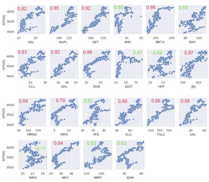
Figure 1. Scatter pairplots and correlation coefficients between portfolio stocks and the S&P 500.
Figure 1 shows that out of the 22 stocks, 8 have a correlation coefficient less than 70%. Interestingly, except for WEN stock, all the other stocks have a positive correlation with the S&P 500 index.
The full covariance matrix is shown in Figure 2.
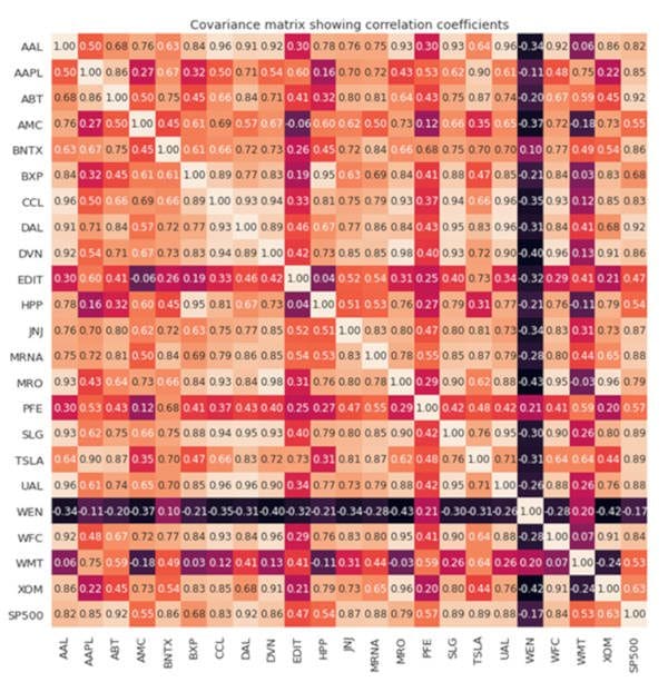
Figure 2. Covariance matrix visualization.
In summary, we’ve shown how the scatter pairplot can be used as a first step for feature selection. Other advanced methods for feature selection and dimensionality reduction include the following: PCA (Principal Component Analysis) and LDA (Linear Discriminant Analysis).
Related:

